Hearst: Newsletters
Art Direction
Ad Marketing Design
Newsletters
Overview
We designed these Hearst Media newsletters to feel warm, accessible, and engaging. Using clean layouts, bold typography, and inclusive imagery, we made each edition easy to read across devices while highlighting Ad Product Marketing updates, diversity, seasonal storytelling, and cultural insights. I focused on creating a consistent, editorial look that invites interaction—helping drive high click-through rates and stronger connections across our teams.


Hearst: DDUs
Art Direction
Branding
UX/UI
Ad Product Marketing
Social Media
Overview
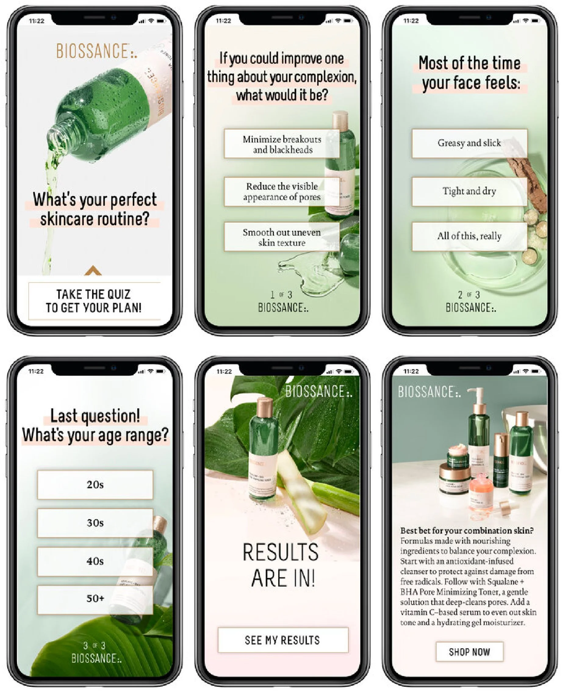
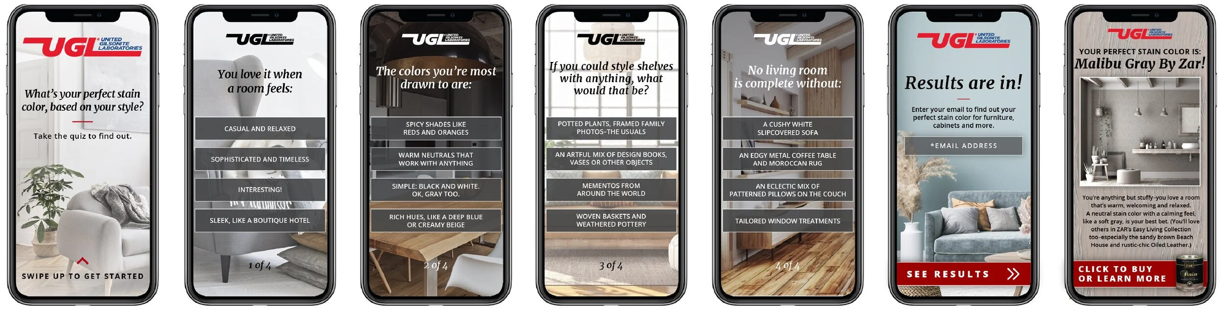
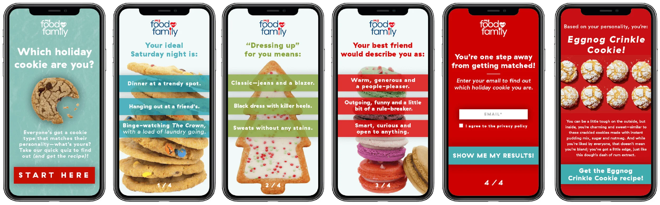
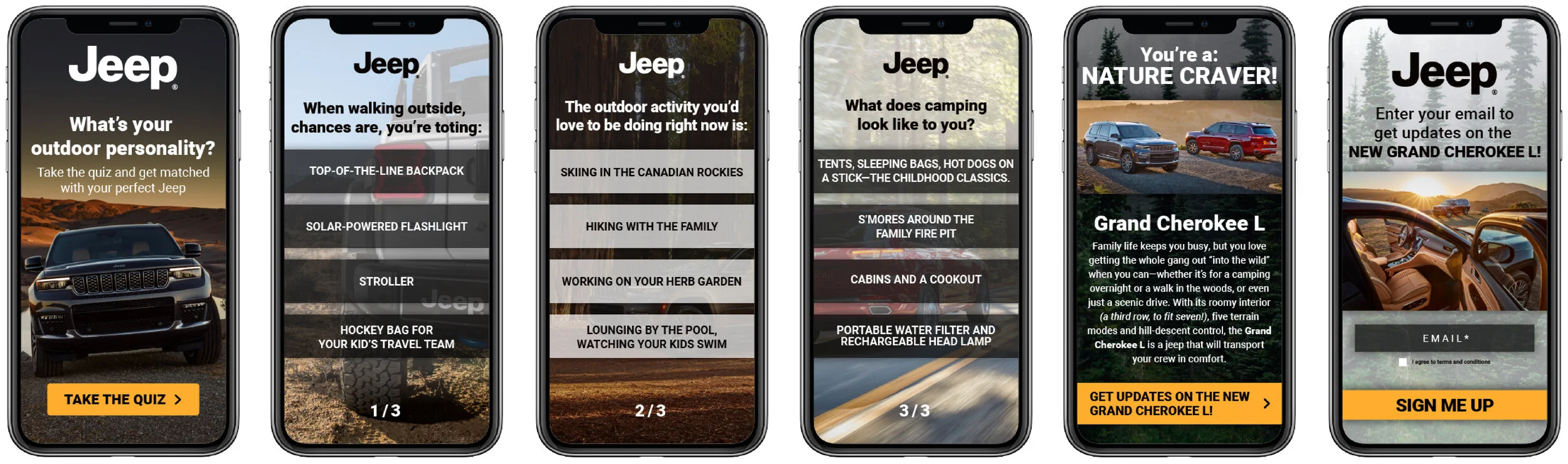
You’ve probably seen a Declared Data Unit (DDU) on social media without even realizing it. They’re those swipe-up videos that lead into a quick quiz—maybe matching you with a product, sharing some fun info, or sending you to a brand’s site. They could show up on a Hearst brand’s story (like Cosmo, Esquire, Good Housekeeping, etc.) or pop up between your friends’ stories. They were super quick, fun, and a great way to get eyes on a brand.
Working on these was always a good time because I got to play with tons of different brand styles all within the same ad format. I’d start by reading through the copy from our writer and checking out the assets the client sent over. Then I’d swing by the brand’s website to see what kind of colors, fonts, and design vibes they usually went for. From there, I’d start laying things out—making sure everything looked good and felt on-brand, while also thinking about the main goal of the DDU (email signups, clicks, engagement, etc.). Once I had everything in place, I’d do a final check with our writer and the client, and then hand it off to our partner, Jebbit, who made it come alive!
Design -> Jebbit Platform Builder


Domino Sugar DDU
Cosmo x Petsmart DDU

Biossance DDU
UGL DDU
Kate Spade DDU

My Food and Family DDU
Good Housekeeping x Petsmart DDU

Jeep DDU
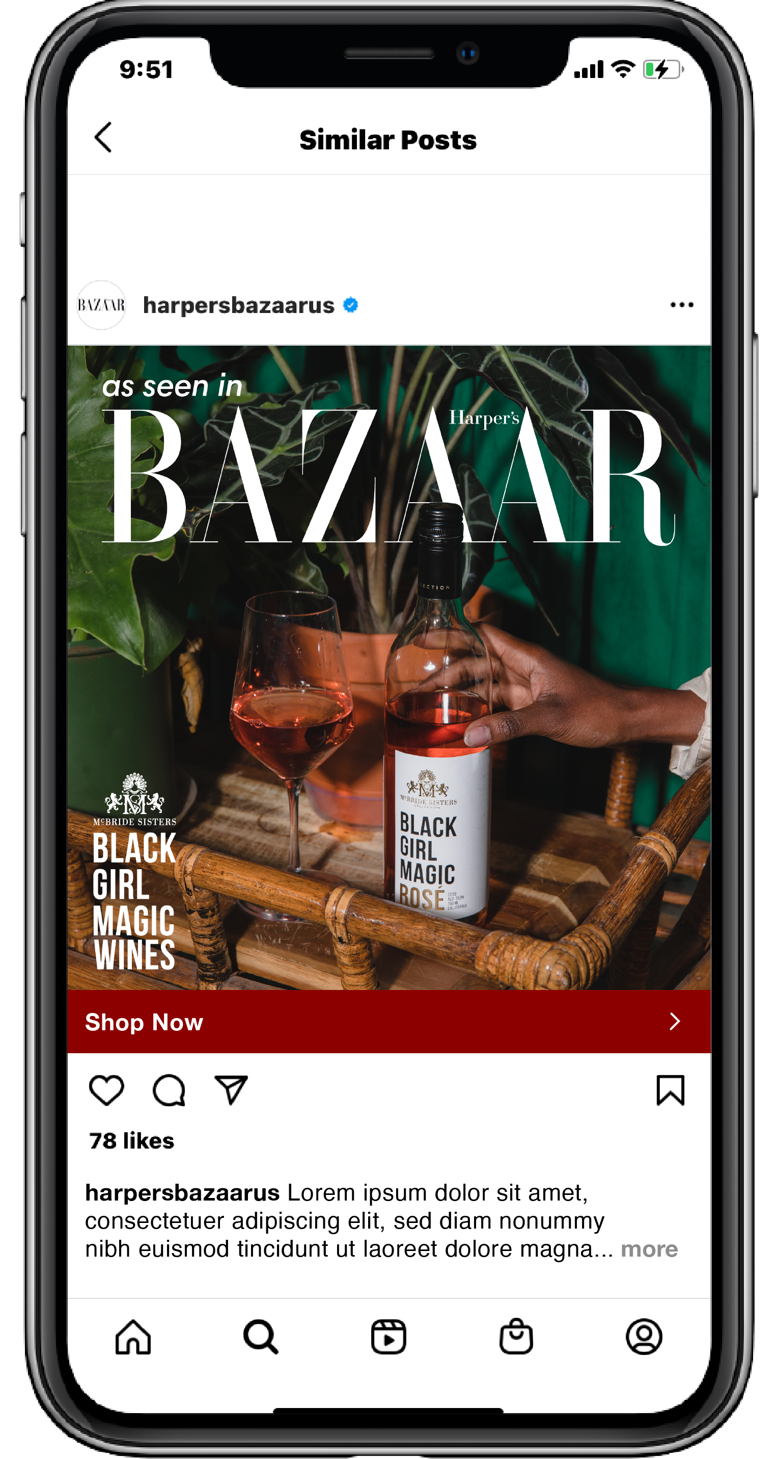
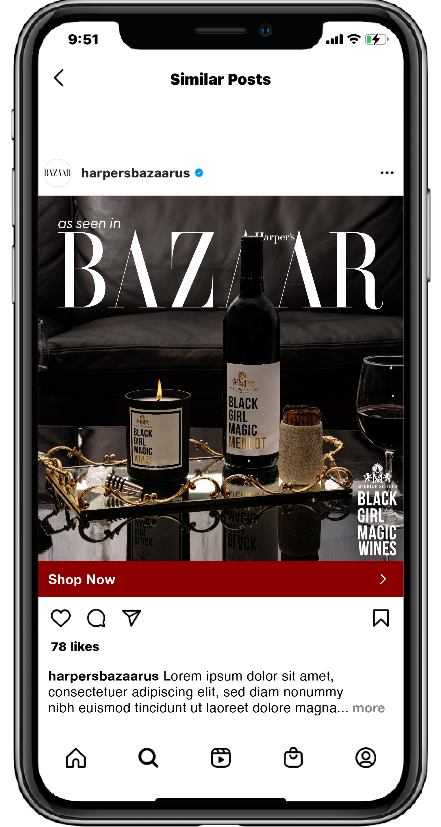
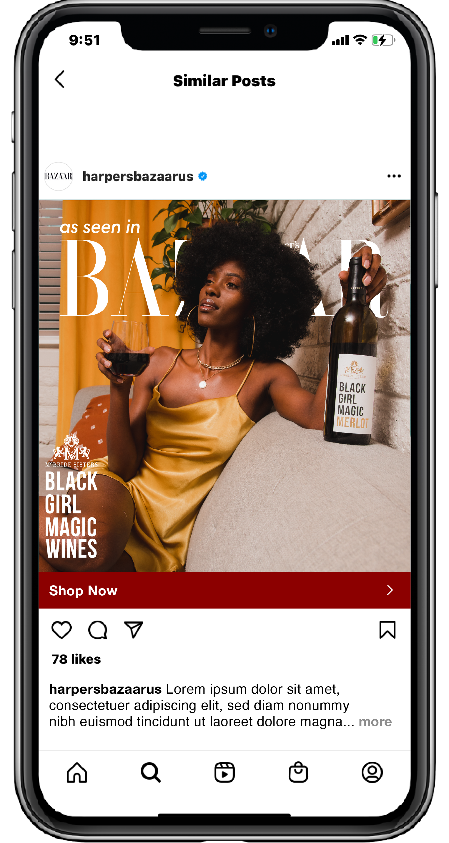
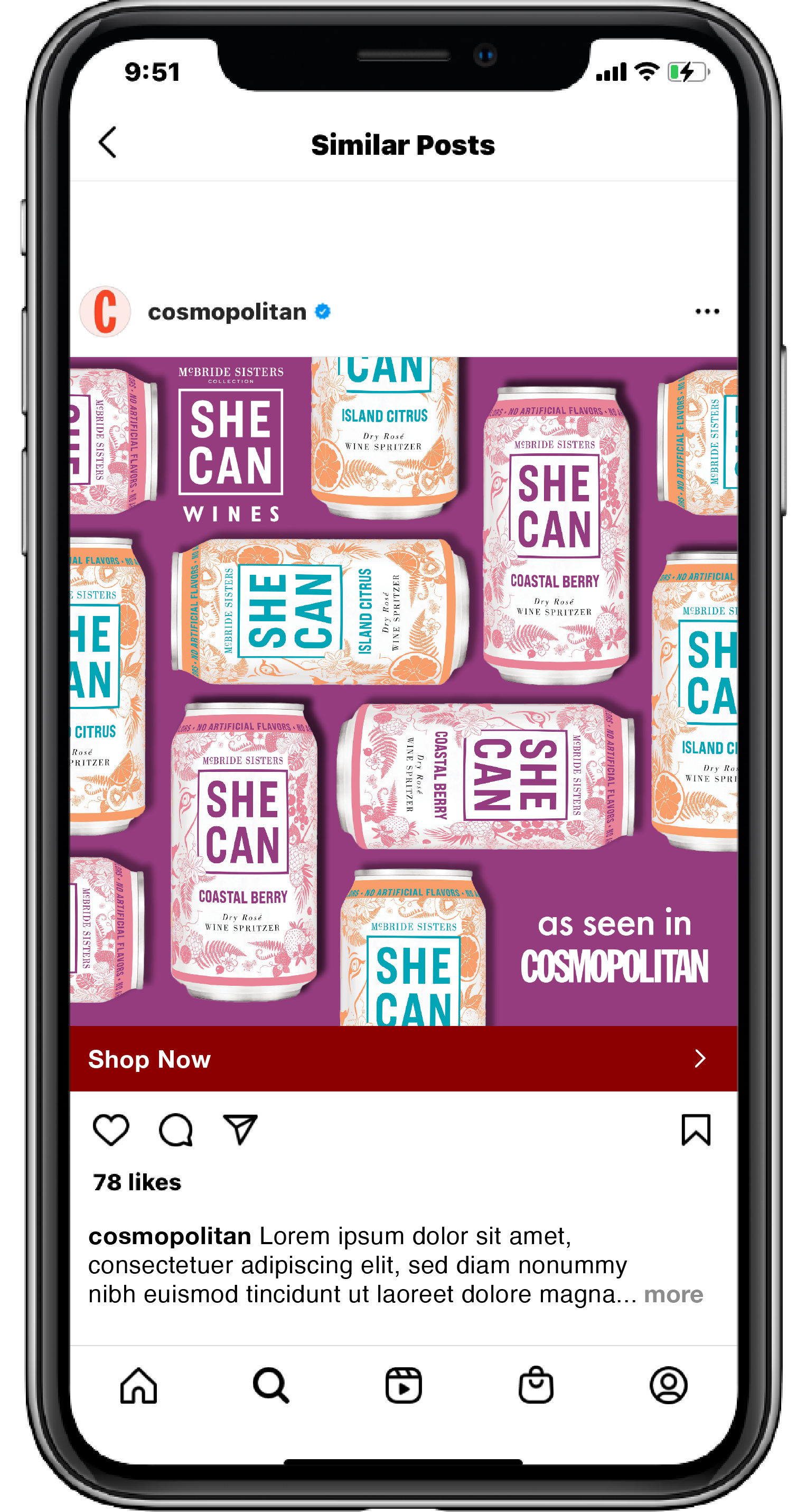
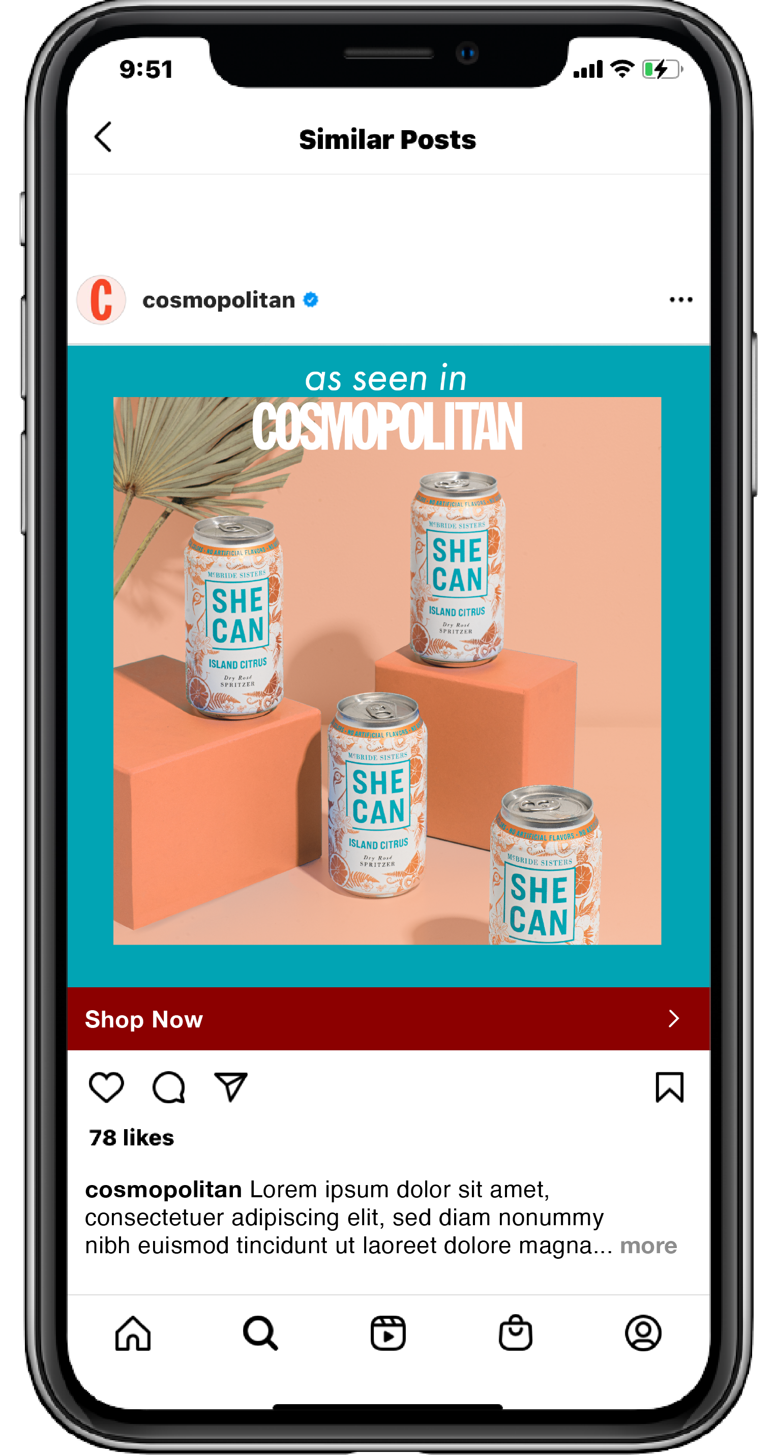
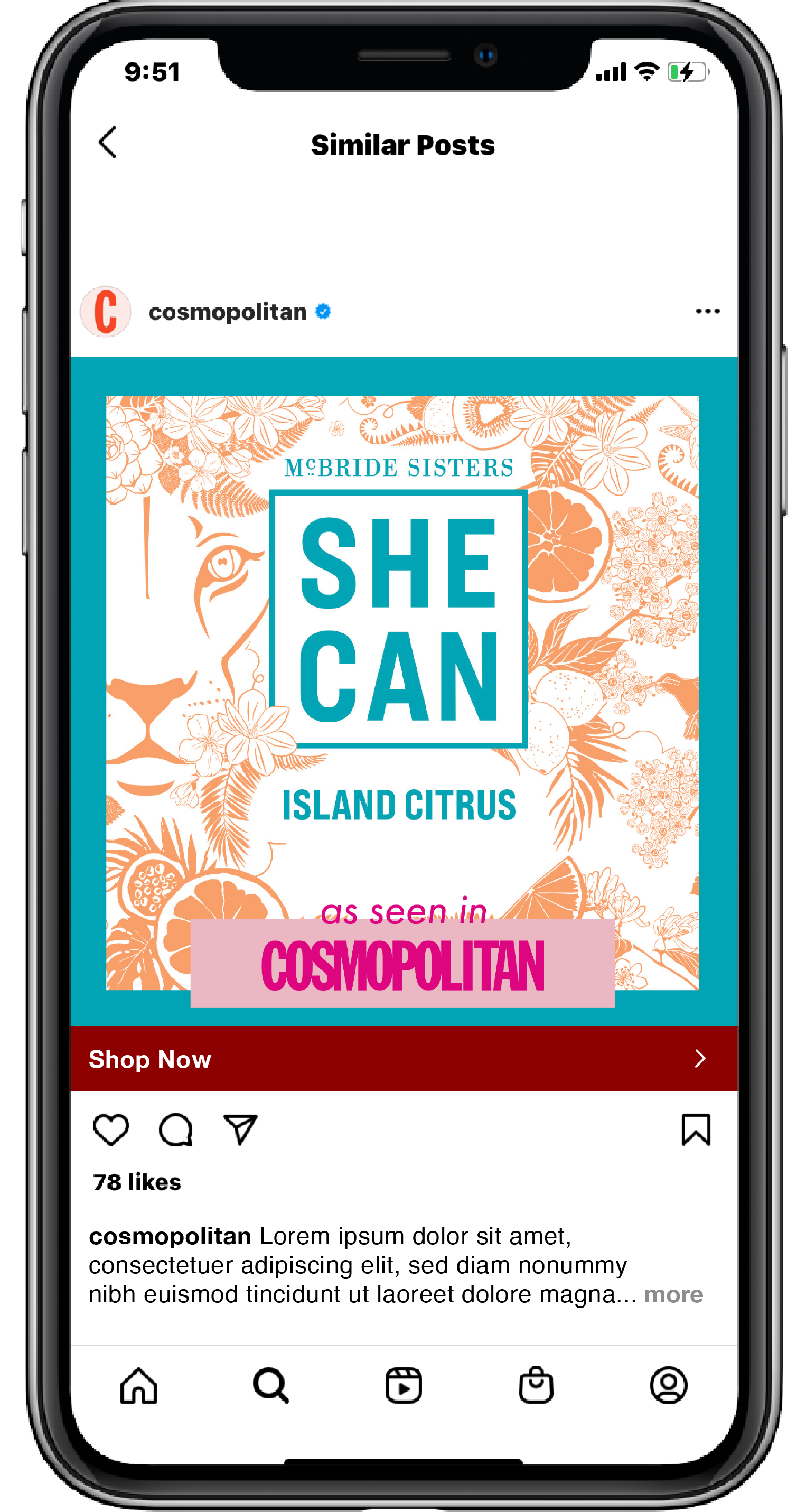
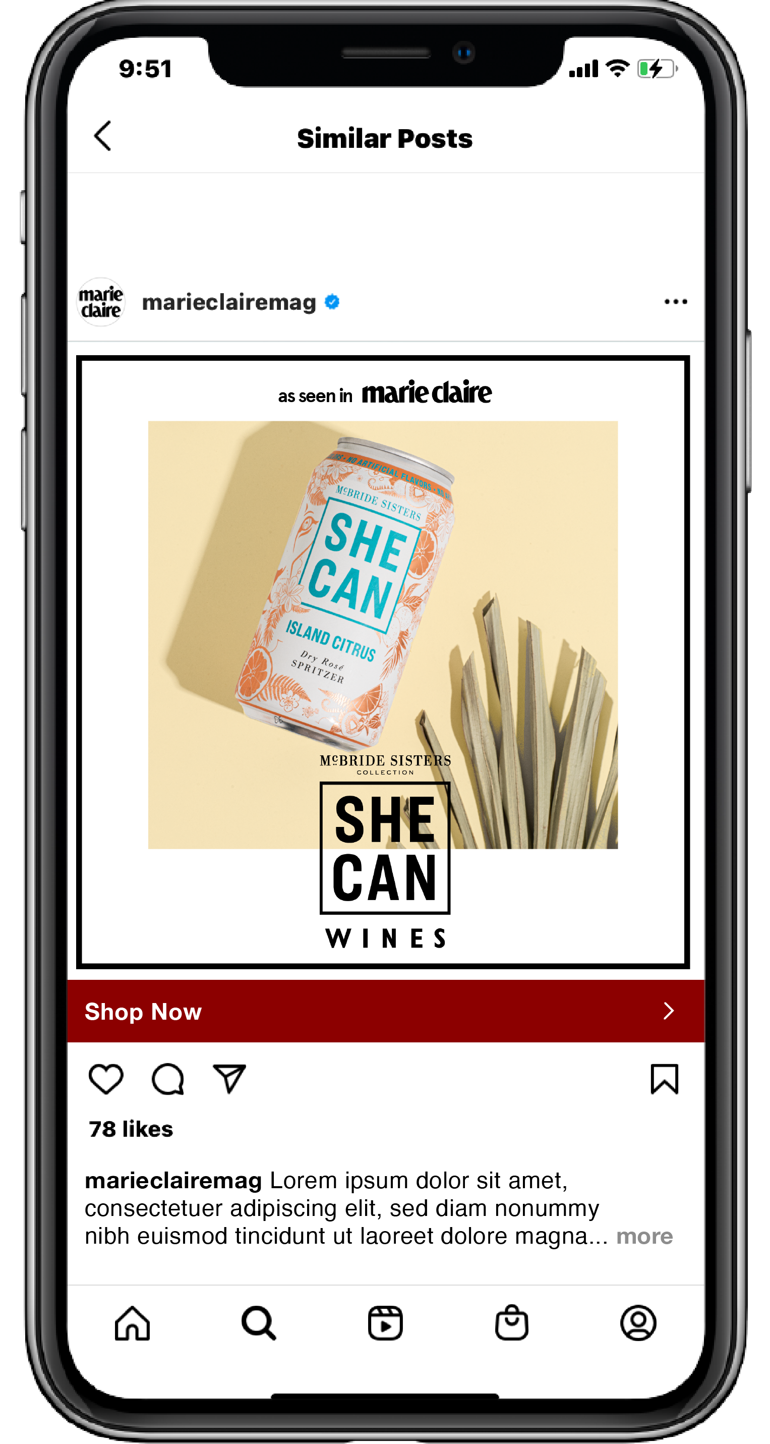
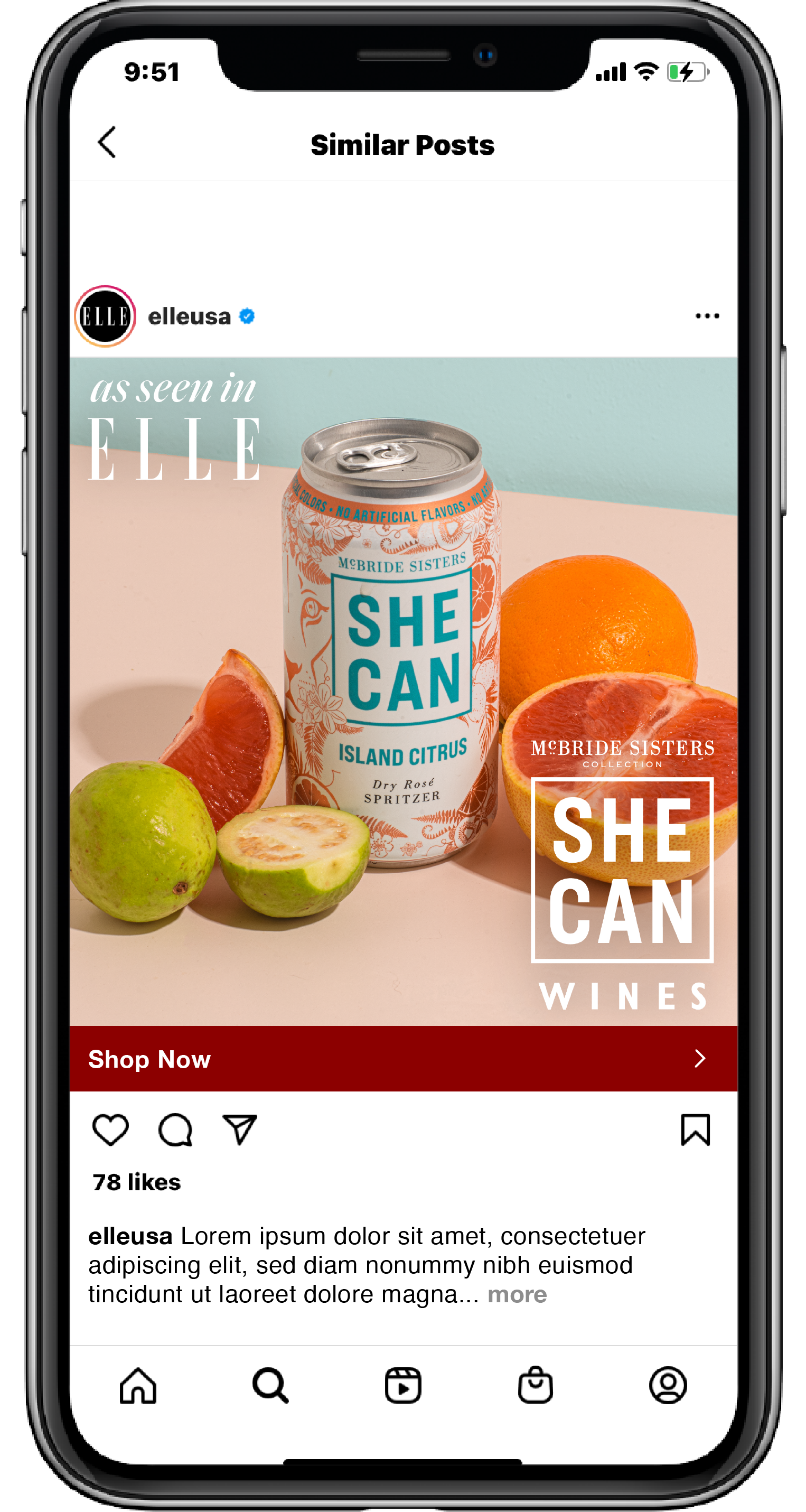
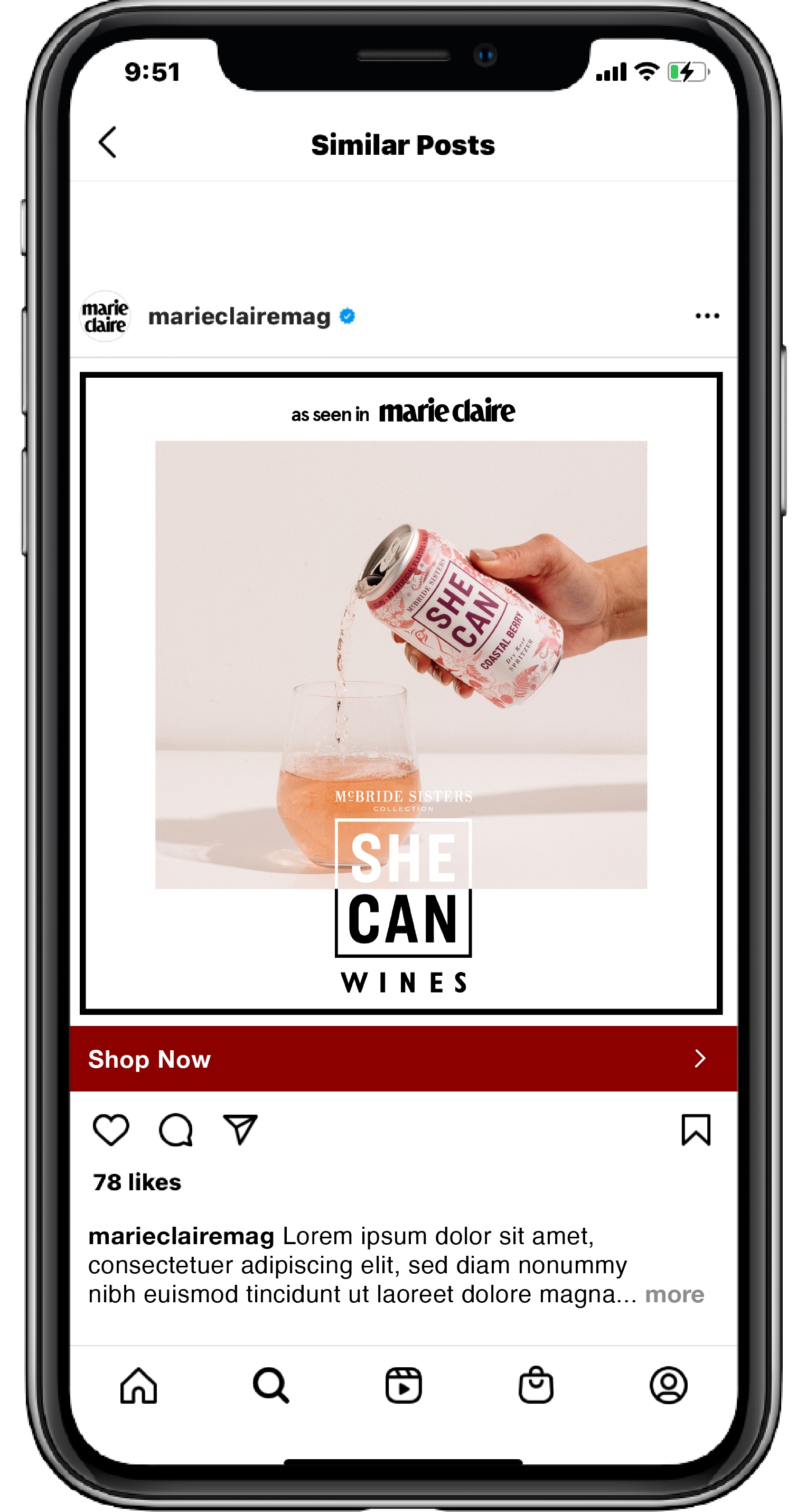
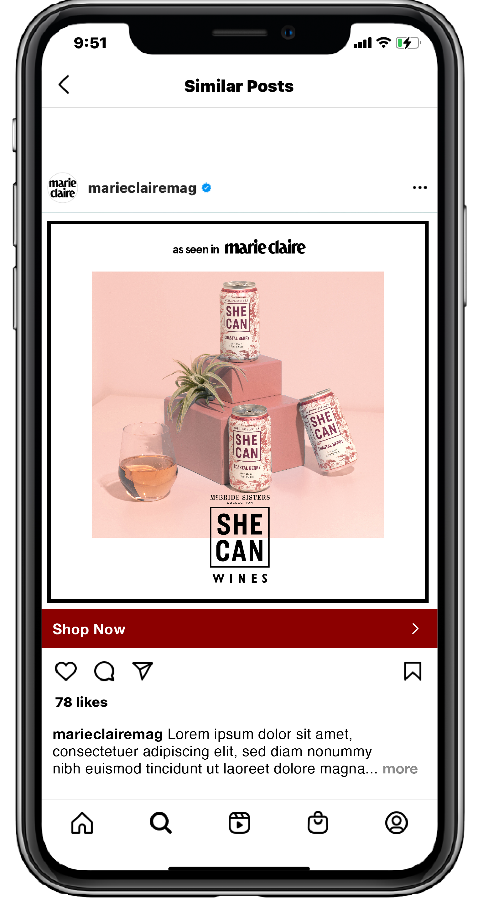
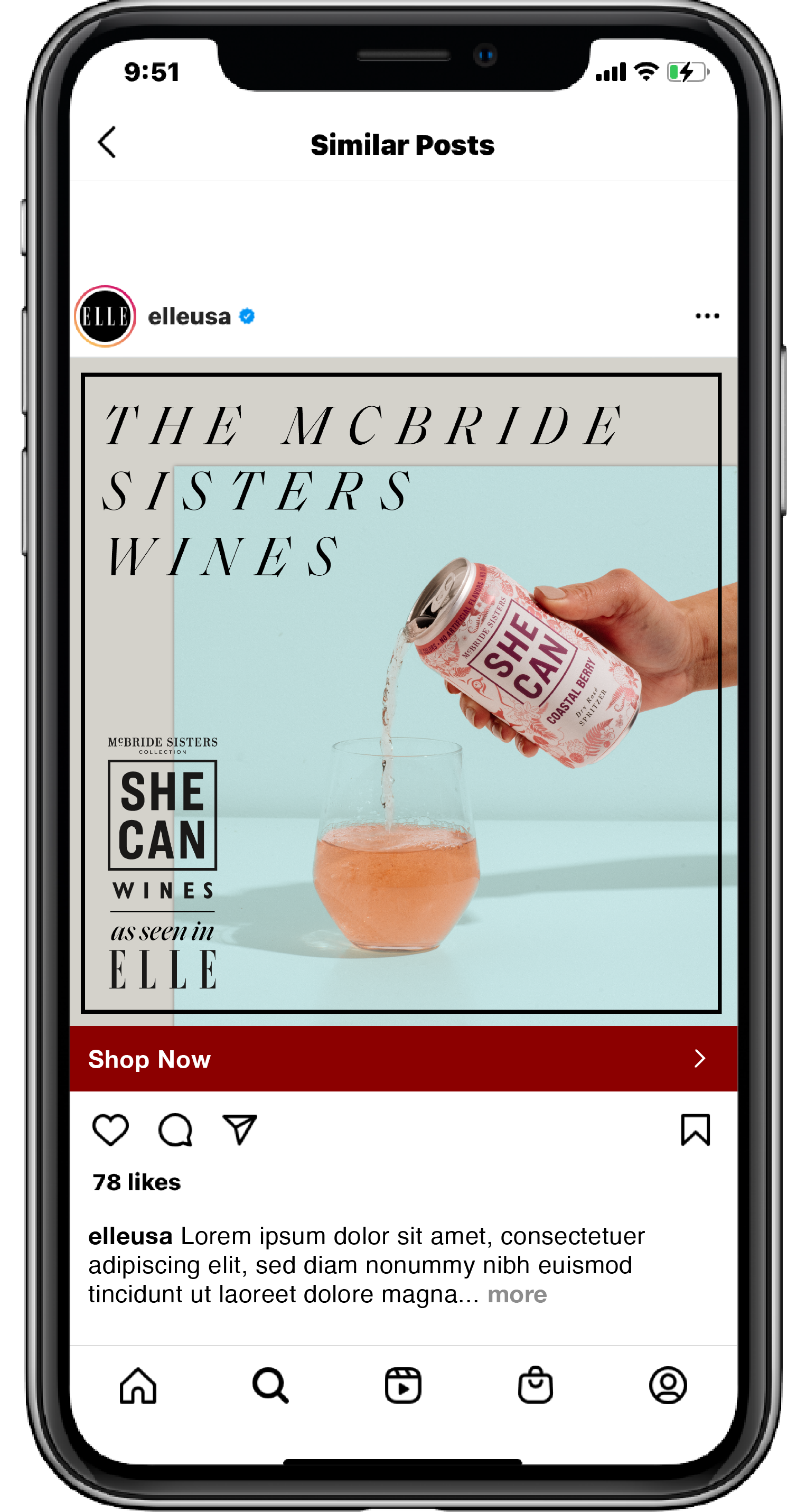
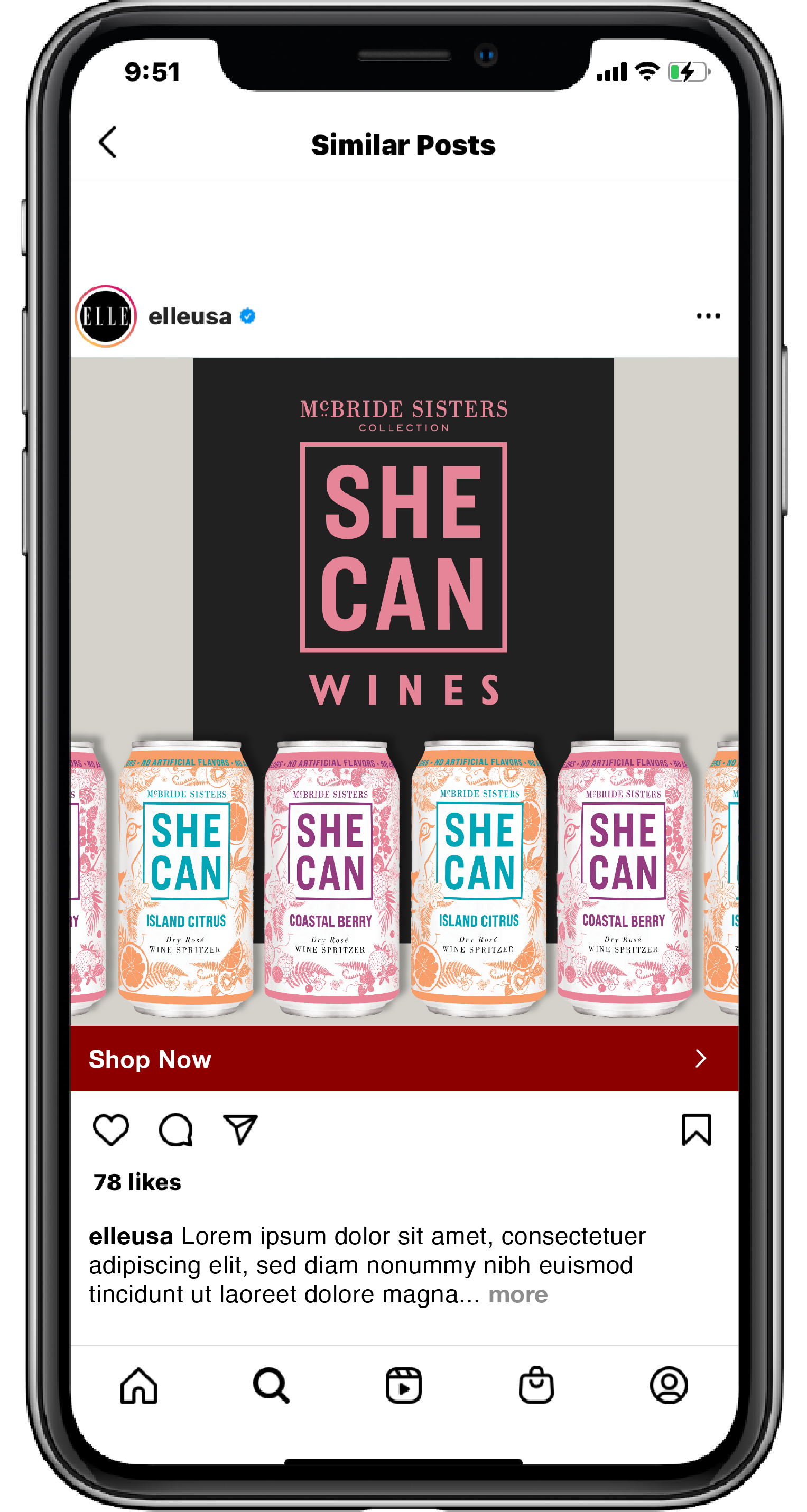
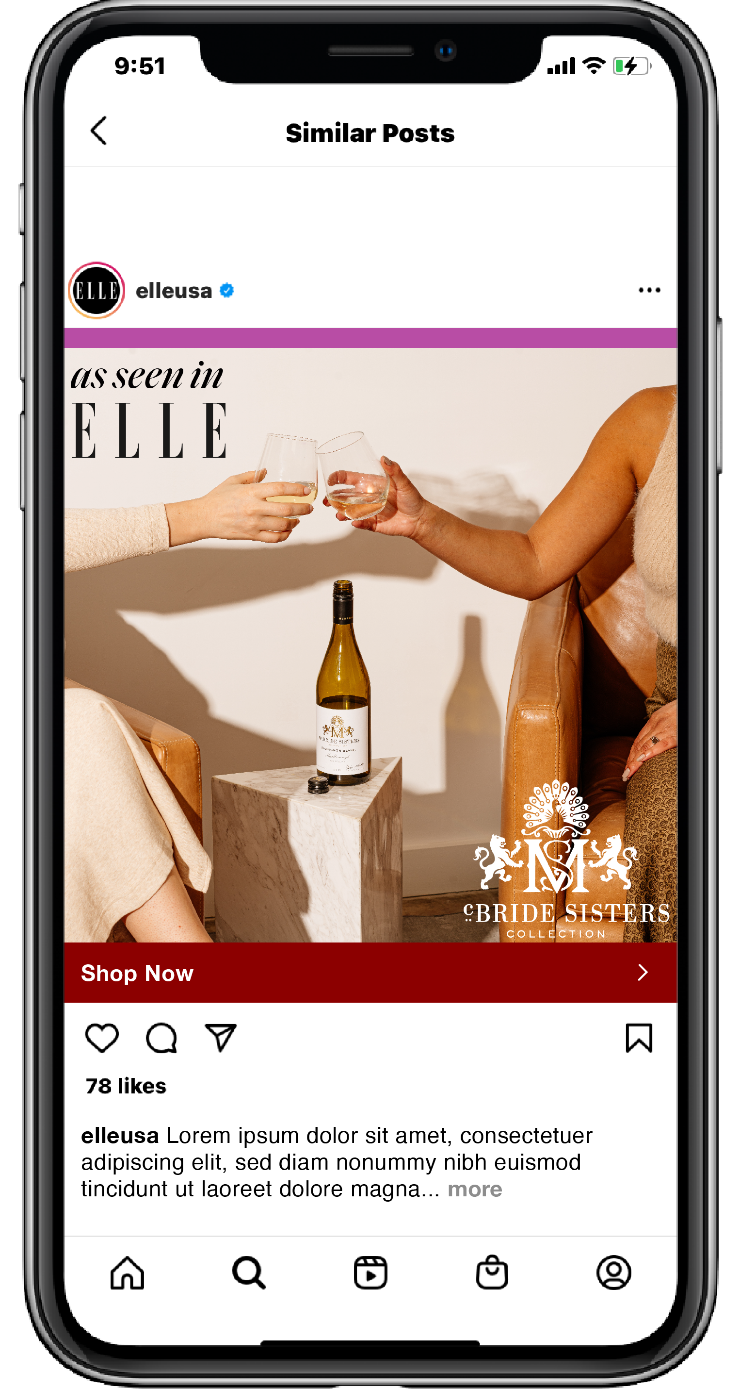
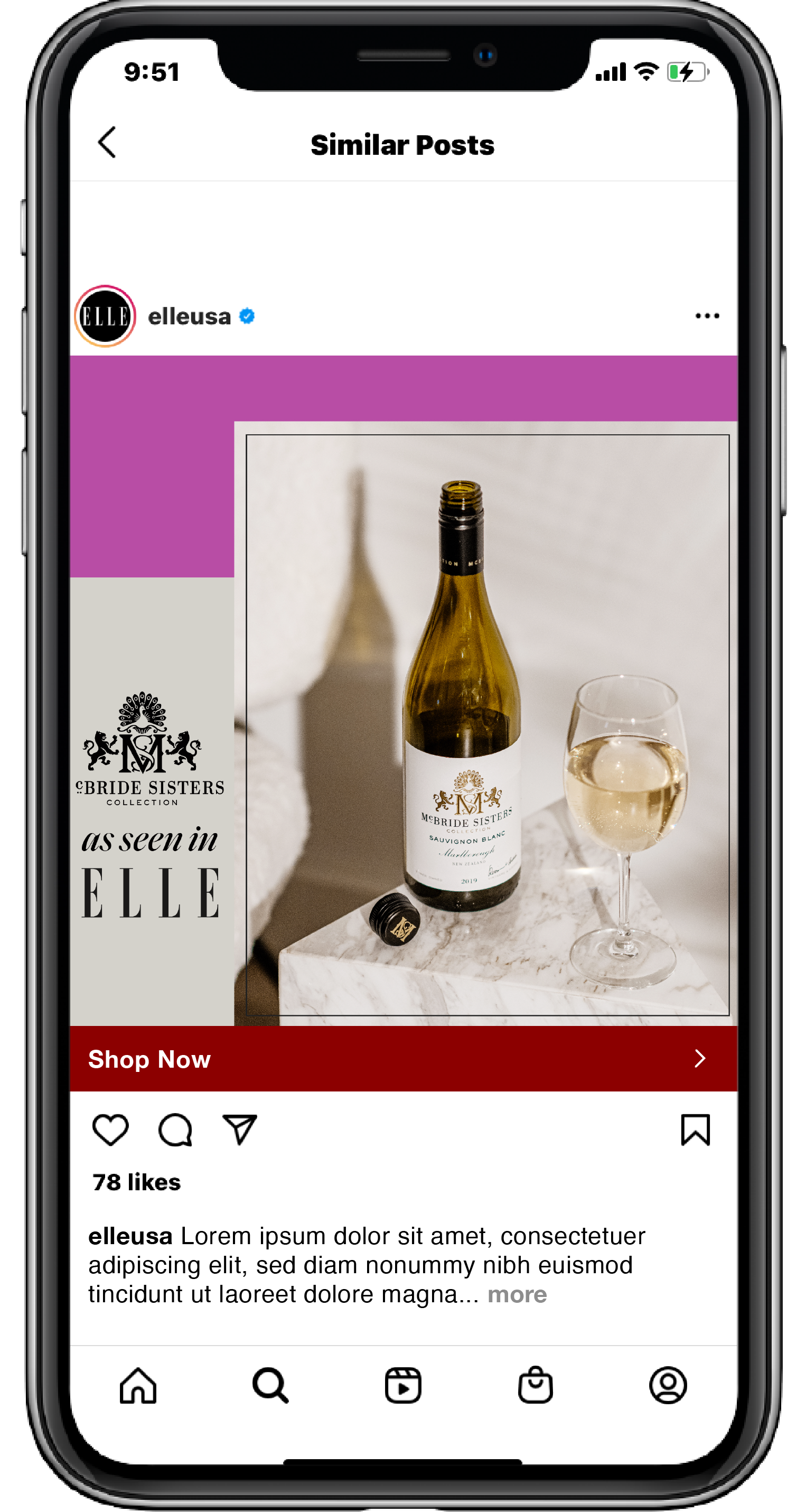
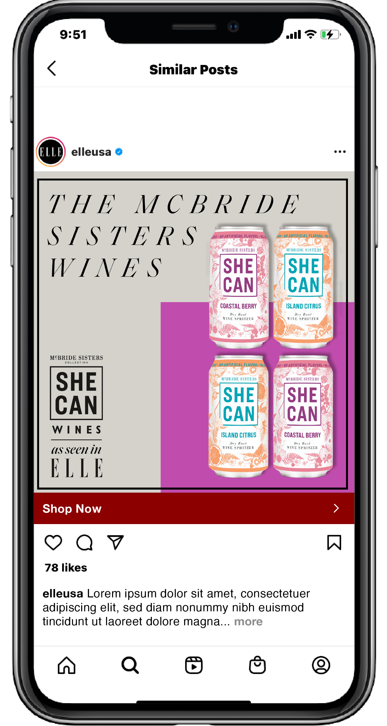
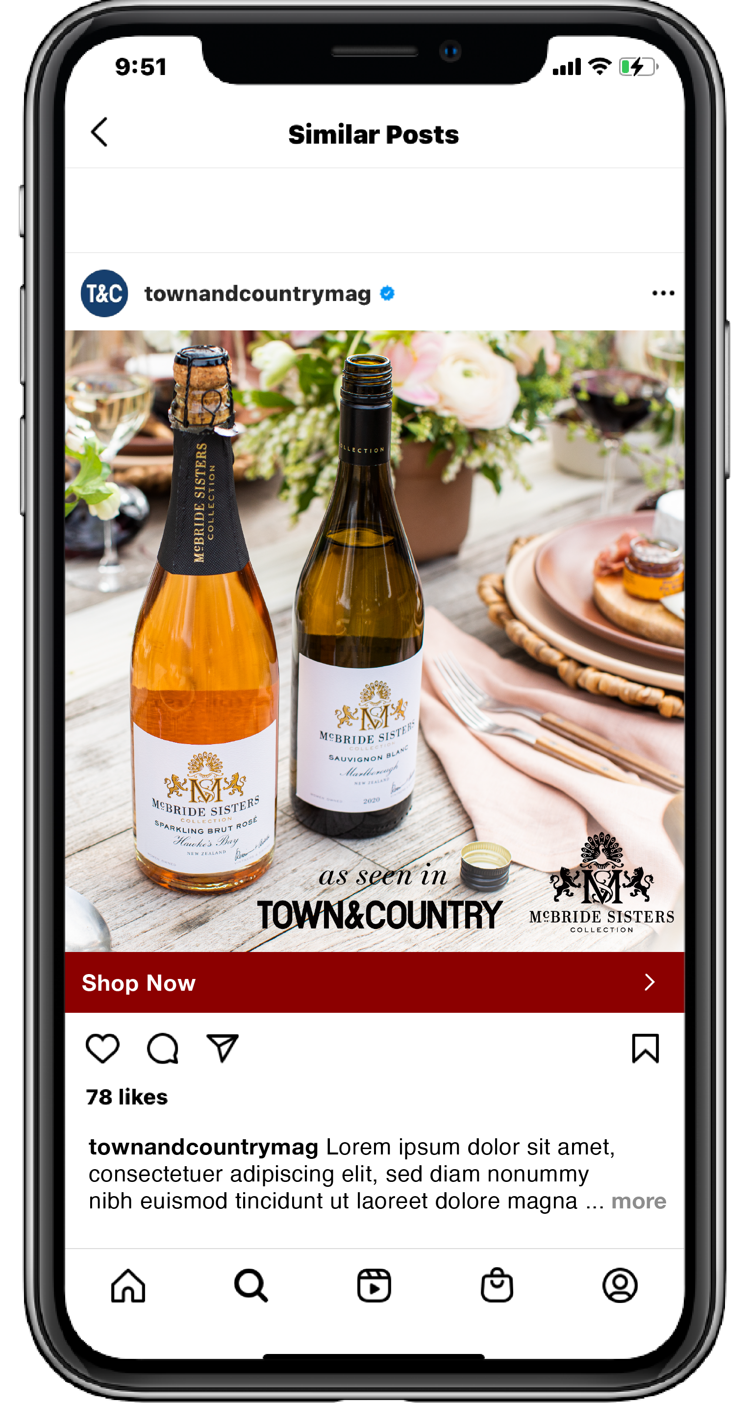
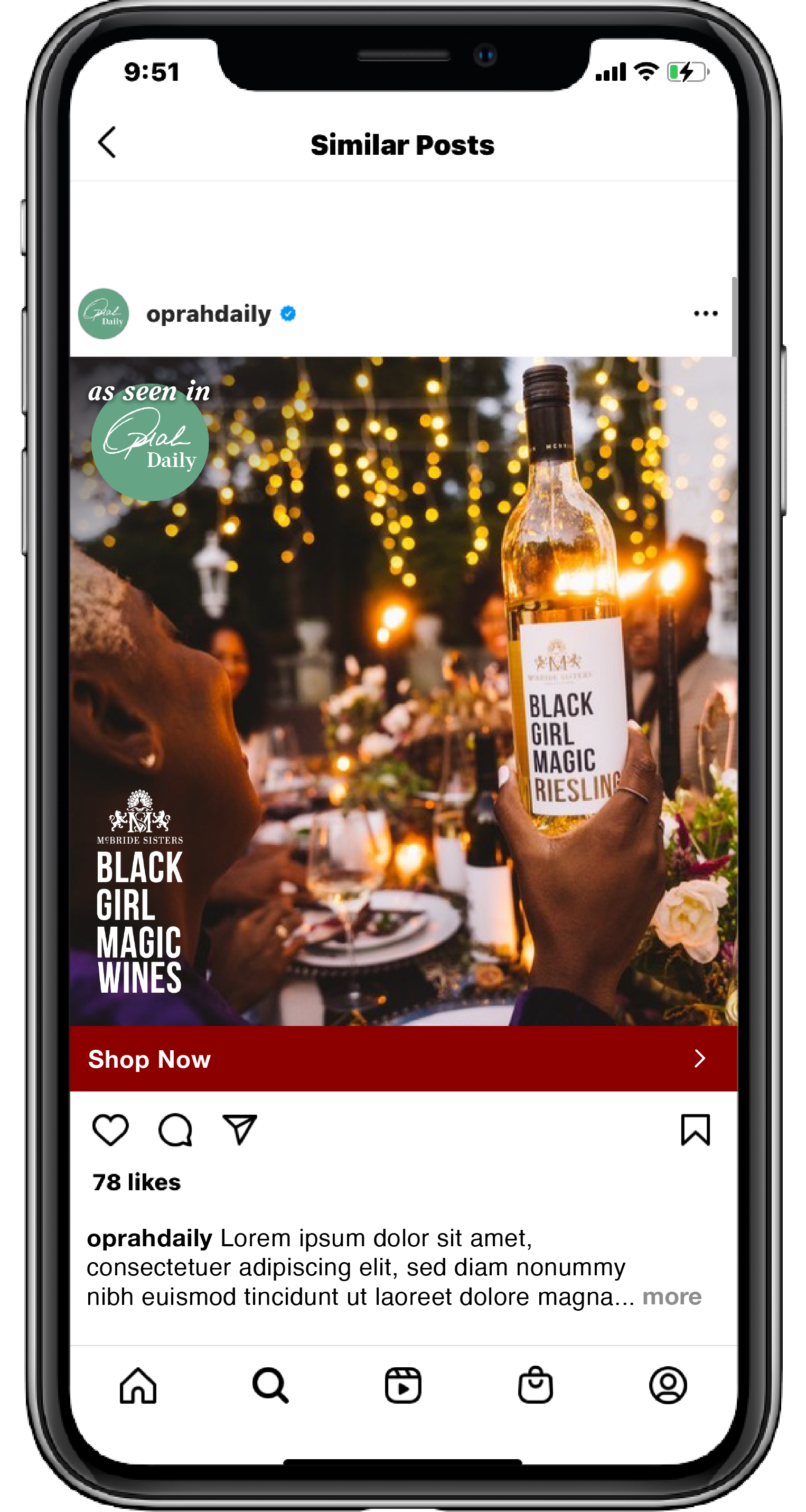
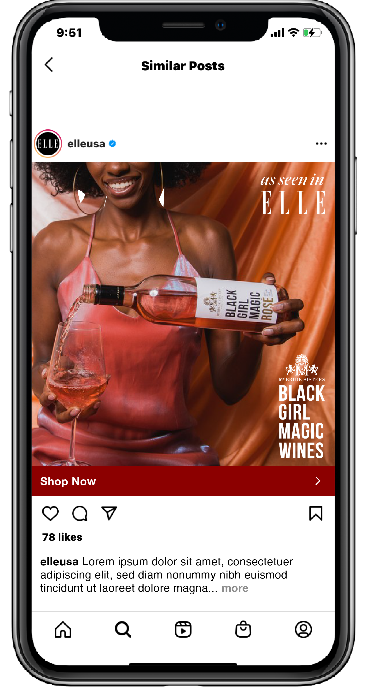
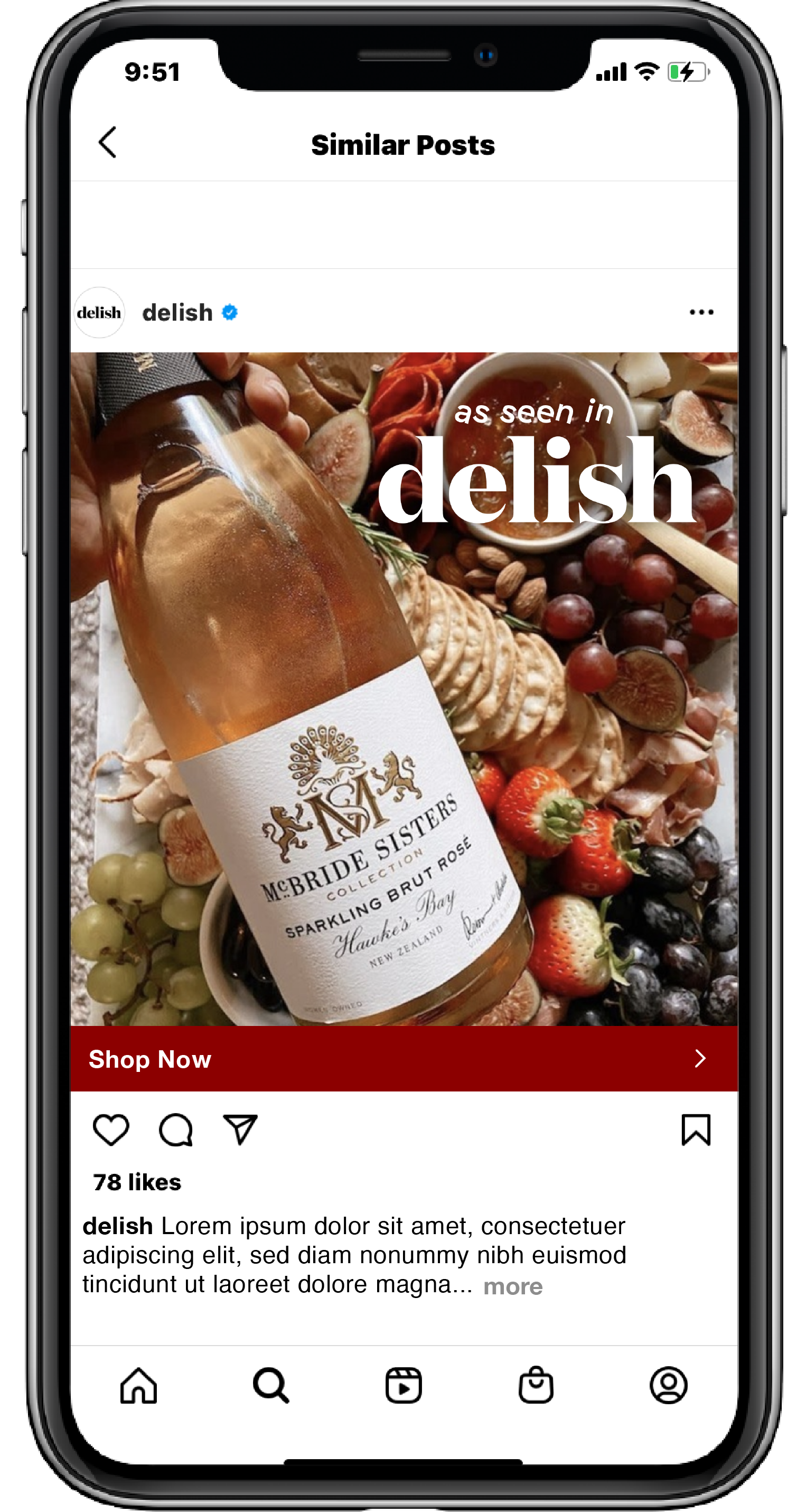
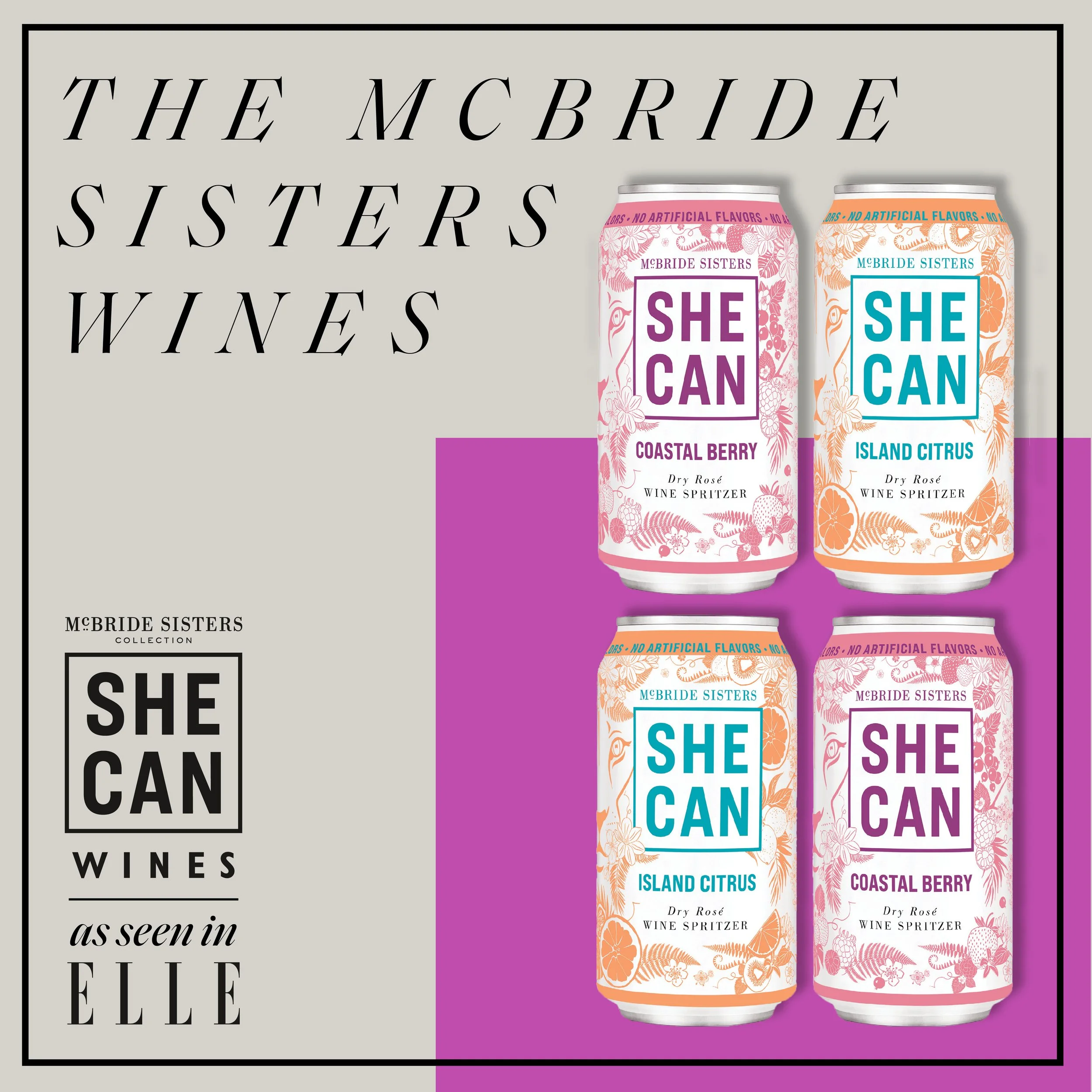
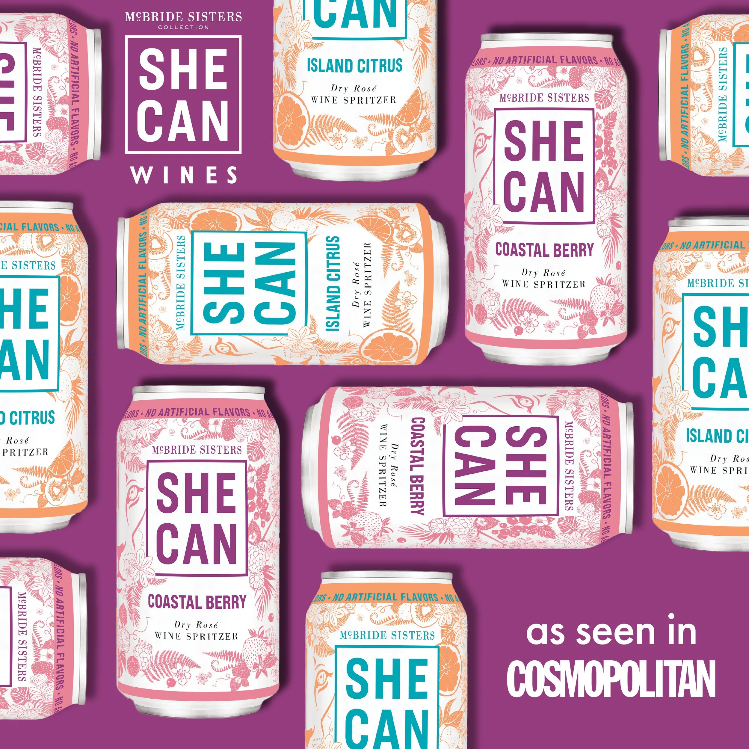
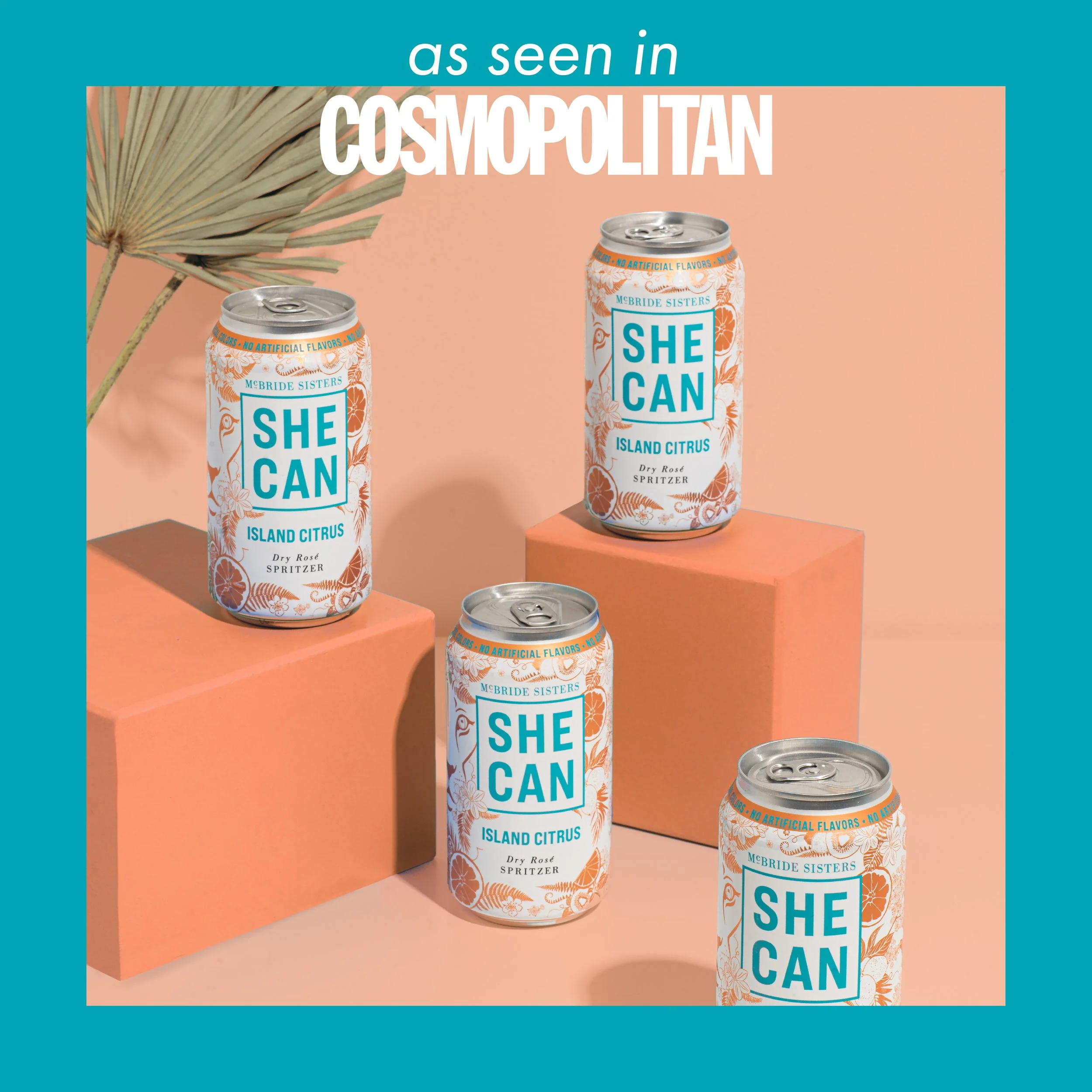
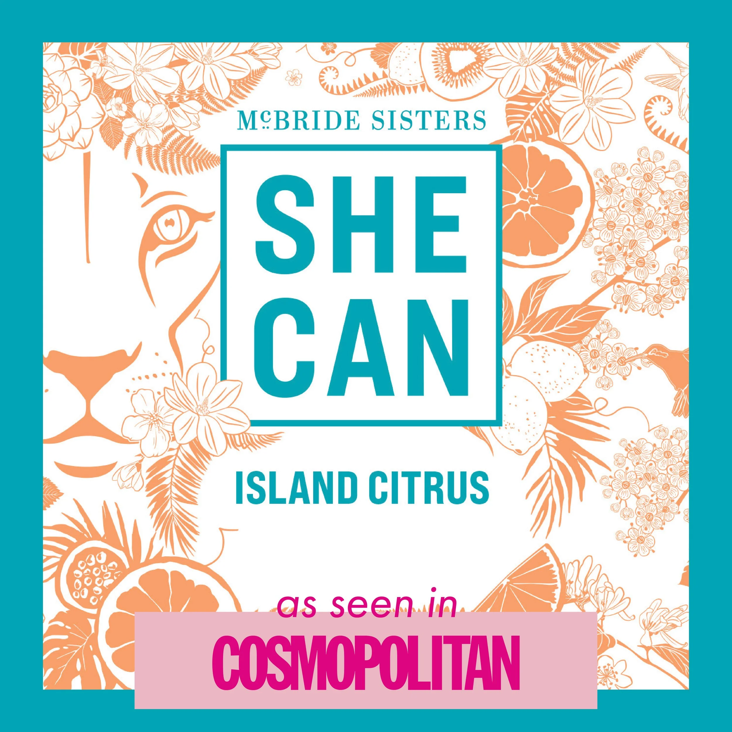
Hearst: McBride Sisters Collab
Art Direction
Photography
Social Media
Overview
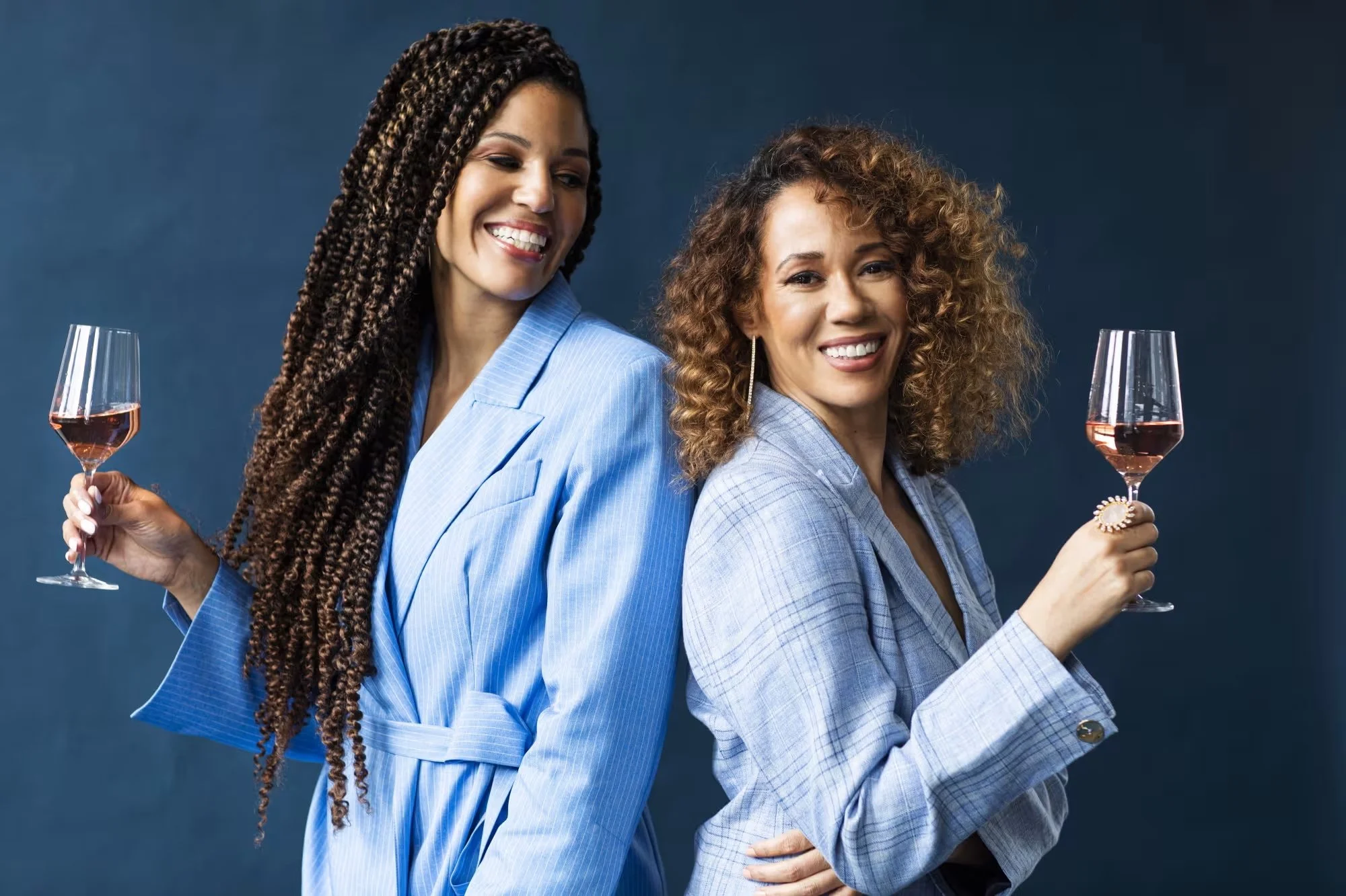
Black Girl Magic wine is a brand I will never NOT fan girl about in the aisle of a libations store. BGM’s timeline follows infant sisters separated at birth who reunite as young adults, reforming their bond over long nights sipping assortments of wine and dreaming of their futures intertwined. Thus, the vision was born to put their own sprinkle of magic into something others may sip and sing of life together, building a community as they do. It felt fully aligned to weave their shadowed yet joyous narrative into a decadent social campaign, then blast it across the world from multiple brands, on several platforms. Theirs was a message to be amplified.
Mockups